Logo design for insurance agency
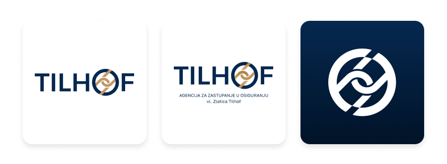
The logo for Tilhof Insurance was designed to communicate trust, security, strength, and unity. The circular shape represents wholeness, protection, and a sense of safety, creating a strong and stable visual foundation.
Within the circle, interconnected chain links symbolize strength, reliability, and the strong connections between the company and its clients. Each link represents support and security, while together they form a unified and resilient whole.
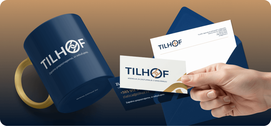
The color palette combines dark blue and gold. Dark blue conveys trust, stability, professionalism, and security, while gold adds a sense of quality, value, and confidence. Together, these elements create a timeless and distinctive identity that reflects the values of Tilhof Insurance.