Logo design for Human Operating System
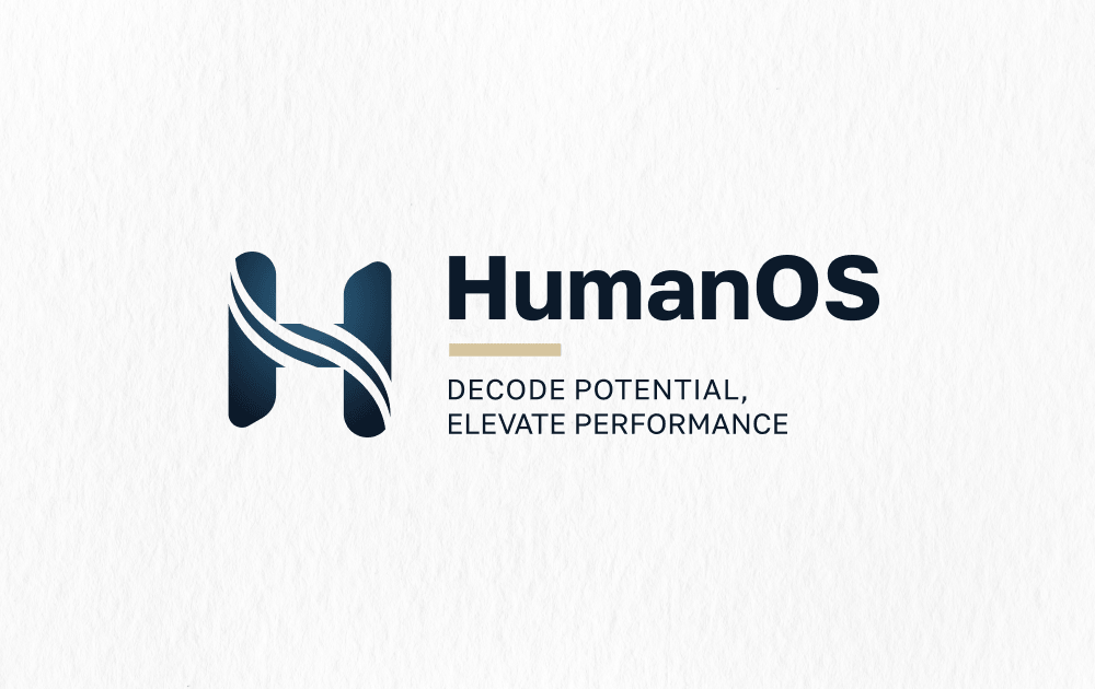
The HumanOS logo is designed as an abstract representation of the Human Operating System – not the human being itself, but the deeper architecture of human consciousness, perception, and inner processes. The name itself also has OS aluding to city of Osijek (abreviation OS), not only Operating System.
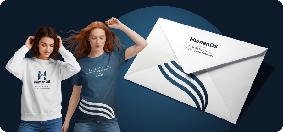
The symbol is built from clean geometric forms, creating a sense of stability, precision, and coherence. The stylized letter “H” is integrated into the mark through flowing, curved lines that suggest movement, continuity, and the constant flow of information within human consciousness.
These interconnected lines also represent connection and the idea of a bridge; between different layers of awareness, between thought and experience, and between the internal and external worlds.
The blue color reinforces the identity with associations of intelligence, clarity, depth, trust, and technology.