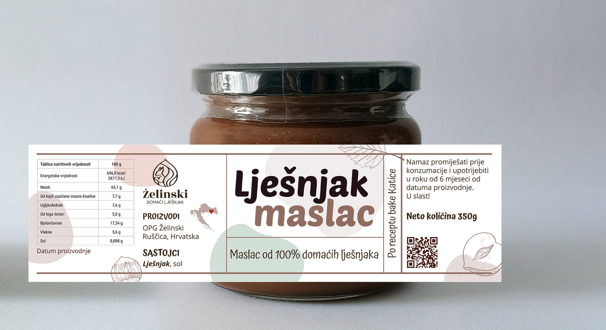
Hazelnut Family Brand – Logo & Branding Design
Family-owned business specializing in growing hazelnuts and producing homemade, healthy hazelnut spreads. Forget about Nutella—this is the real deal, crafted with care and quality ingredients straight from their orchard.
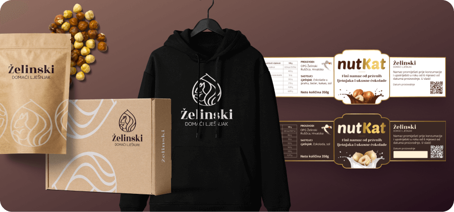
The logo features a custom illustration of a squirrel cleverly shaped like a hazelnut, symbolizing both nature and the product’s core ingredient. It’s paired with a refined sans-serif typeface that adds a sense of elegance and trust. The visual identity uses a warm, natural color palette—rich browns, soft pastel beige, and touches of gold—to evoke wholesomeness, tradition, and a hint of luxury, positioning the brand as a premium, authentic alternative in the market.
