UX redesign for Independent AgTech Platform
Advisory Application
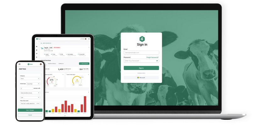
With a direct digital connection to all of customer’s farms (gathering raw data), this advisor application track key metrics and gain insights helping users to save time and provide the best customer experience.


Situational Awareness
The main purpose of the application is to give a clear overview of the farm status – animal health, production and profit to end user (farm manager, advisor, vet).
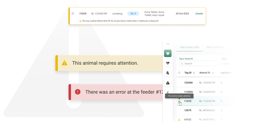
In order to achieve this, the system have a developed system of alerts and notifications connected to visual data representation.
Personalisation at its Finest
Each farm is different, regardless the animal species and each farm has it own familiar system on how to read different metrics.
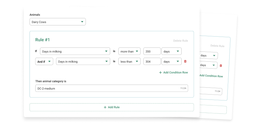
We created an Admin portal with complete farm customisation module – from creating the animal categories to adding custom condition rules for data representation and alerts.

Customised Automation Rules
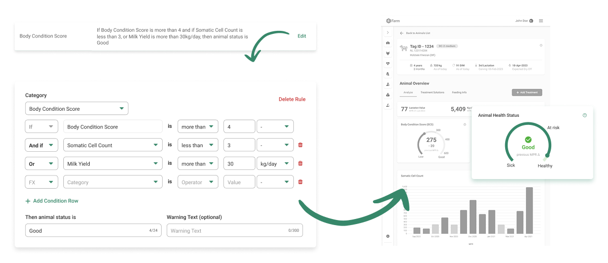
Rules set under Health are connected to health carts at category page and single animal profile. Also, these rules trigger customised warnings if they are filled in provided input field.
Customised rules under Admin portal are also enabled for customised advice, general farm settings and many more farm-related categories. With this functionality, we have made it possible for each client to fully customise the application to their farm and analyse the data that optimises their business.

